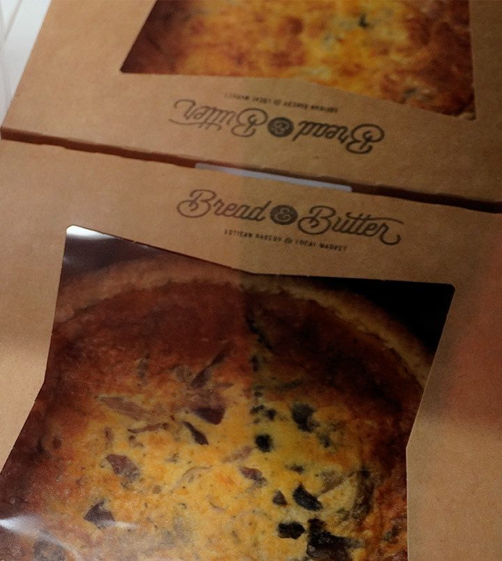
Bread & Butter Artisan Bakery & Local Market in Red Bank needed their nearly completed logo refined and finalized for their official launch. The objective was to build upon their existing foundation and capture the true essence of their craft in a versatile, fun, and welcoming brand identity.
The core of their operation revolves around intentional baking and high-quality sourcing. They partner with local farmers to use fresh, seasonal ingredients without any preservatives. Most importantly, every loaf is mixed, shaped, and scored by hand using a "low and slow" fermentation technique. Instead of rushing production with extra yeast, the bakery relies on time as their secret ingredient to unlock the full flavor of simple grains.
This concept of time became the driving force behind the finalized design. The primary emblem features a dodecagon, a twelve-sided polygon that serves as a badge representing the twelve hours on a clock. Secondary variations incorporate subtle clock ticks, providing a dynamic and playful visual system that the bakery can easily adapt across different packaging and signage applications.
To further mirror the tactile nature of artisan baking, the typography features extensive custom handwork to reflect the physical process of shaping bread. The resulting brand system successfully captures the founders' vision, celebrating the patience and manual craft behind their incredible breads, pastries, and baked goods.